Charts
There are times when a visual representation of data can be more insightful than a report to identify trends and relationships.
Charts is a powerful and intuitive tool designed to create engaging and informative charts. The visual Chart Designer allows users to quickly specify metrics, groups, filters, and many other parameters to create a chart tailored to their organization’s needs. Several chart types are available including Bar, Pie, Line, and Area.
Navigation
- Navigate to the backstage menu by clicking on the ServicePRO icon.
- From the Analytics tab, click on the Charts option as highlighted below.
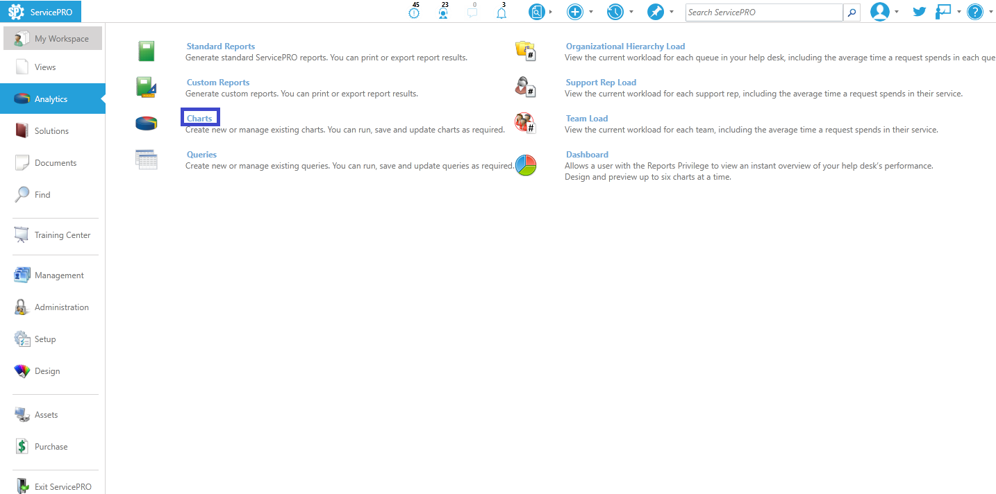 Chart Navigation
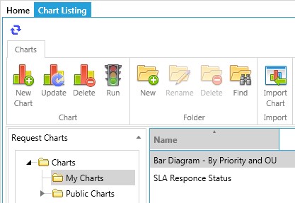
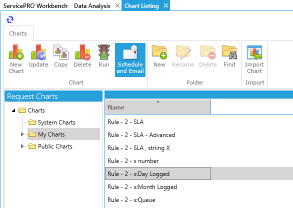
Charts provides a snapshot view of your Service Desk activity. To view a chart already created in ServicePRO, you can select from the following folders:
- System Charts – These ready to view ServicePRO Charts have been designed with some common service desk metrics that are measured on a regular basis.
- My Charts – Charts that have been created by the current user and saved as private.
- Public Charts – List of all public charts grouped by user that created them.
From the folders list in the Request Charts panel, as shown in the figure below, click on a folder and then select the chart from the right panel. Double click the chart name or click on the Run button. This will open a new window allowing you to preview the chart. From this window you have the ability to update the chart with additional criteria.
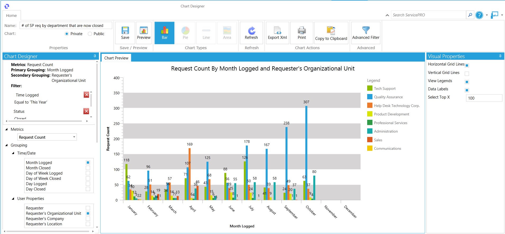
Create a New Chart
To create a new chart select the option for ‘New Chart’. This will open up the Chart Designer window with the following design properties:Metrics - Metrics to be represented on the chart. You can select from the following options:
- Request Count
- Average Time to Respond
- Average Time to Resolution
- SLA Response Status
- SLA Resolution Status
Please note that Average Time to Respond and SLA Response Status charts are dependent on the Response Time Definition that was selected in System Options - > Service Level Agreements Tab.
Grouping – A Primary Grouping (mandatory) and a Secondary Grouping (optional) can be selected for each chart. The two groupings can be selected from any of the following categories:
- Time/Date
- User Properties
- Request Properties
Filters - Set Data Filters to specify the data range you want to include in the chart. You can select from the Basic Filter which loads in the left pane automatically and includes some common ServicePRO data fields or you can display the Advanced Filter which can be selected from the ribbon.
From the Ribbon work area, the following actions can be completed:
- Enter Chart Name
- Set Public or Private Chart - accessibility options
- Save/Preview Chart
- Set Chart Type – Bar, Pie, Line or Area
- Refresh Chart
- Export to XML
- Copy to Clipboard
- Export to Excel
- Set Advanced Filter
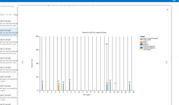
Once the chart is designed you can click on the Preview button to preview the chart as shown in the figure below.
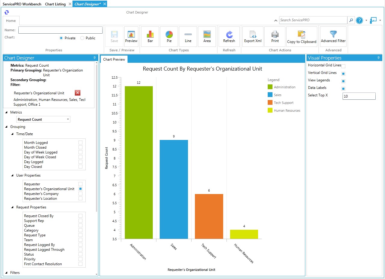
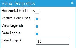
Once you have created a chart, you can adjust the chart presentation to suit your preferences using the buttons provided on the Visual Properties panel, as shown below.
Visual Properties Panel
- Horizontal Grid Lines – Enable your chart to display horizontal grid lines
- Vertical Grid Lines – Enable your chart to display vertical grid lines
- View Legends – Specify whether the legend should be shown or hidden
- Data Labels – Enable text labels to indicate metric values for each group
- Select Top X – Select the maximum number of results to display on the X-axis – i.e. Show the Top “X” results in this criteria. Additional results after this value will be cut off. Please note that the Top X limit can be increased from System Options
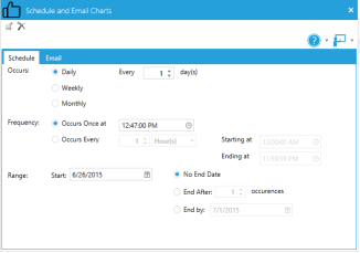
Schedule Automatic Generation and Emailing of Custom Charts
Users can email Charts on a scheduled basis, similar to the option for emailing Custom Reports. A Schedule and Email icon is available in the Ribbon Toolbar for the Manage Charts view.
- The user can select a chart from the listing, then select “Schedule & Email” from the Charts section of the Ribbon Toolbar.
- The “Schedule and Email Charts” dialog will be displayed, allowing the user to set a schedule and select an email templates or create a new template.
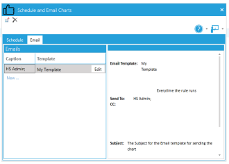
- The user will receive an email with the chart attached as a JPG image.
If a chart does not contain any results at time of being generated for emailing, by default, only the original creator of that chart will receive notification email(s) stating that there are no records to display on chart.
If the creator does not wish to receive the email, an option is available to switch the no records notifications to be sent to all the notification email recipients instead. Please contact ServicePRO Technical Support for more information and assistance in enabling this feature.